
Mobile-First Design for Restaurants
With over 60% of restaurant-related searches now happening on mobile devices, a mobile-first design approach is no longer optional—it's essential for survival and growth. Mobile-first means designing your digital presence for the smallest screen first, then adapting to larger devices, rather than the traditional approach of designing for desktop and scaling down. This philosophy impacts everything from your restaurant website in India and online ordering system to your QR code food menu and marketing emails.
A mobile-first approach recognizes that potential customers are likely discovering your restaurant while standing in line, commuting, or making spontaneous dining decisions. If your digital presence isn't optimized for these moments, you're missing critical opportunities. Beyond mere responsiveness, true mobile-first design considers thumb navigation, page load speed, and mobile-specific user behaviors to create seamless experiences that convert browsers into diners. For restaurants aiming to grow restaurant business online, mobile optimization is the foundation of digital success.
Why Mobile-First is Non-Negotiable for Restaurants
The case for mobile optimization extends far beyond basic responsiveness to fundamental business metrics.
1. Mobile Dominates Restaurant Discovery and Ordering
The customer journey increasingly begins and ends on mobile devices.
- Local Search Behavior: 88% of "near me" searches happen on mobile devices, making local SEO for restaurants dependent on mobile optimization.
- Delivery and Takeout Growth: Mobile orders account for over 70% of delivery and takeout transactions.
- Spontaneous Decision Making: Customers often decide where to eat while mobile, requiring instant access to menus, prices, and availability.
2. Google's Mobile-First Indexing
Google now primarily uses the mobile version of content for indexing and ranking, making mobile optimization essential for visibility.
- Search Ranking Impact: Mobile-friendly sites rank higher in mobile search results.
- Page Experience Signals: Core Web Vitals (loading, interactivity, visual stability) directly impact search rankings.
- Local Pack Eligibility: Poor mobile experience can exclude you from valuable local pack listings.
3. Conversion Rate Implications
Mobile users have different behaviors and expectations that directly impact conversion rates.
- Higher Abandonment Rates: Mobile users abandon sites that load slowly or are difficult to navigate.
- Thumb-Friendly Design: Interfaces must accommodate one-handed use and thumb reach zones.
- Reduced Patience: Mobile users expect to find information within seconds or they'll move to a competitor.
Key Elements of Restaurant Mobile-First Design
Effective mobile design for restaurants requires attention to specific elements that drive conversions.
1. Lightning-Fast Loading Times
Speed is particularly critical on mobile where connection speeds may vary.
- Optimized Images: Compress menu and food photos without sacrificing quality.
- Minimal Code: Reduce CSS, JavaScript, and HTML file sizes.
- Accelerated Mobile Pages (AMP): Consider AMP for critical pages like your menu and location information.
- Content Delivery Network (CDN): Use a CDN to serve content from locations closer to users.
2. Thumb-Friendly Navigation and CTAs
Design for how people actually hold and use their phones.
- Strategic Placement: Position key calls-to-action (CTAs) within easy thumb reach.
- App-Like Navigation: Use familiar mobile patterns like bottom navigation bars.
- Adequate Touch Targets: Buttons and links should be at least 44x44 pixels for easy tapping.
- Swipe Functionality: Implement swipe actions for image galleries and menu categories.
3. Mobile-Optimized Content Hierarchy
Prioritize what mobile users need most when they're on the go.
- Above-the-Fold Priority: Place phone number, address, hours, and order buttons where they're immediately visible.
- Progressive Disclosure: Use expandable sections for less critical information to reduce scrolling.
- Scannable Content: Break text into short paragraphs with clear headings for easy scanning.
- Action-Oriented Language: Use clear, action-oriented text for buttons: "Order Now" rather than "Online Ordering."
Mobile-First Strategies for Key Restaurant Touchpoints
Different aspects of your digital presence require specific mobile optimization approaches.
1. Mobile-Optimized Website Essentials
Your website must serve mobile users' specific needs and contexts.
- Click-to-Call Buttons: Make phone numbers tappable for immediate connection.
- Integrated Maps: Embed interactive maps with directions functionality.
- One-Click Actions: Enable direct actions like ordering, reserving, or messaging with minimal taps.
- Offline Functionality: Implement service workers to cache critical content for unreliable connections.
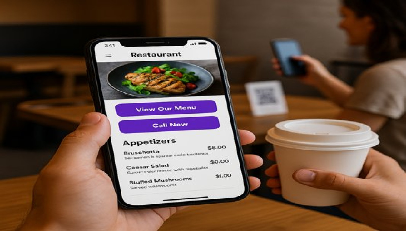
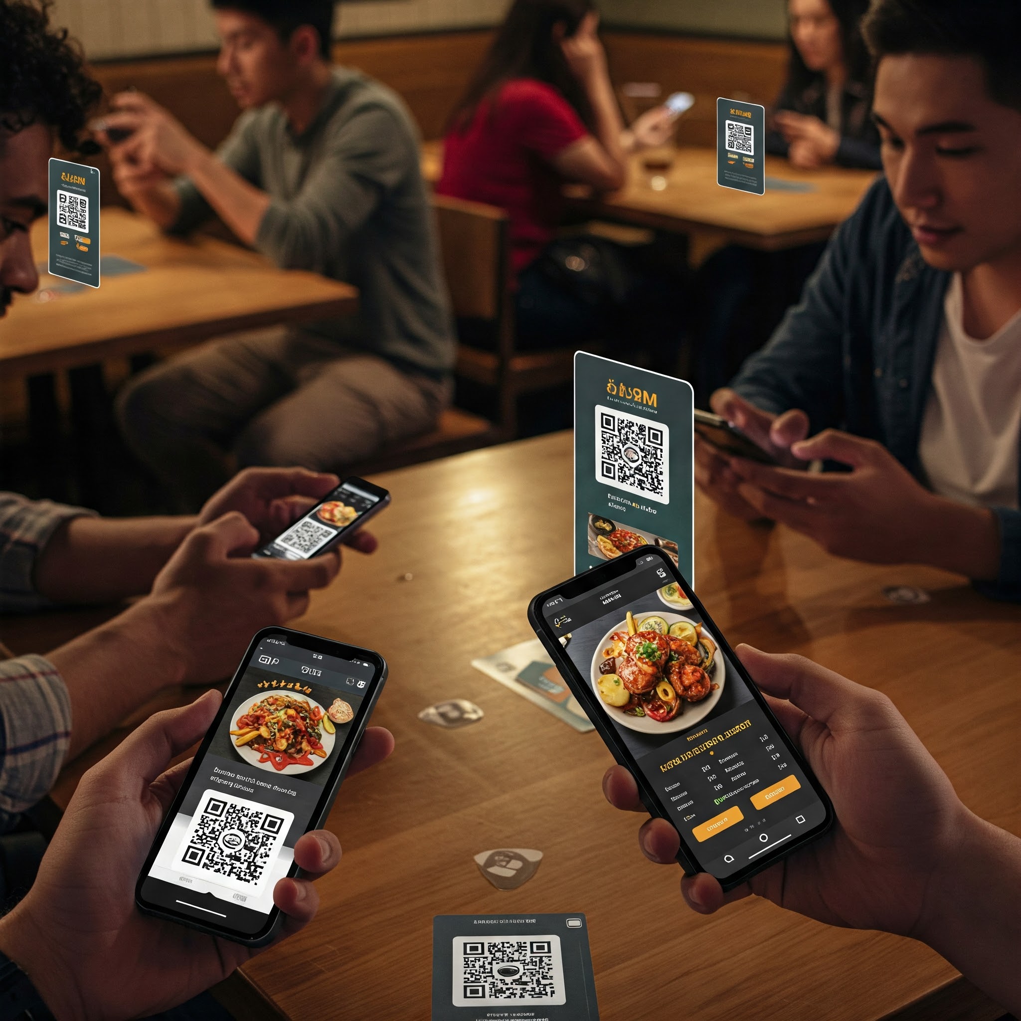
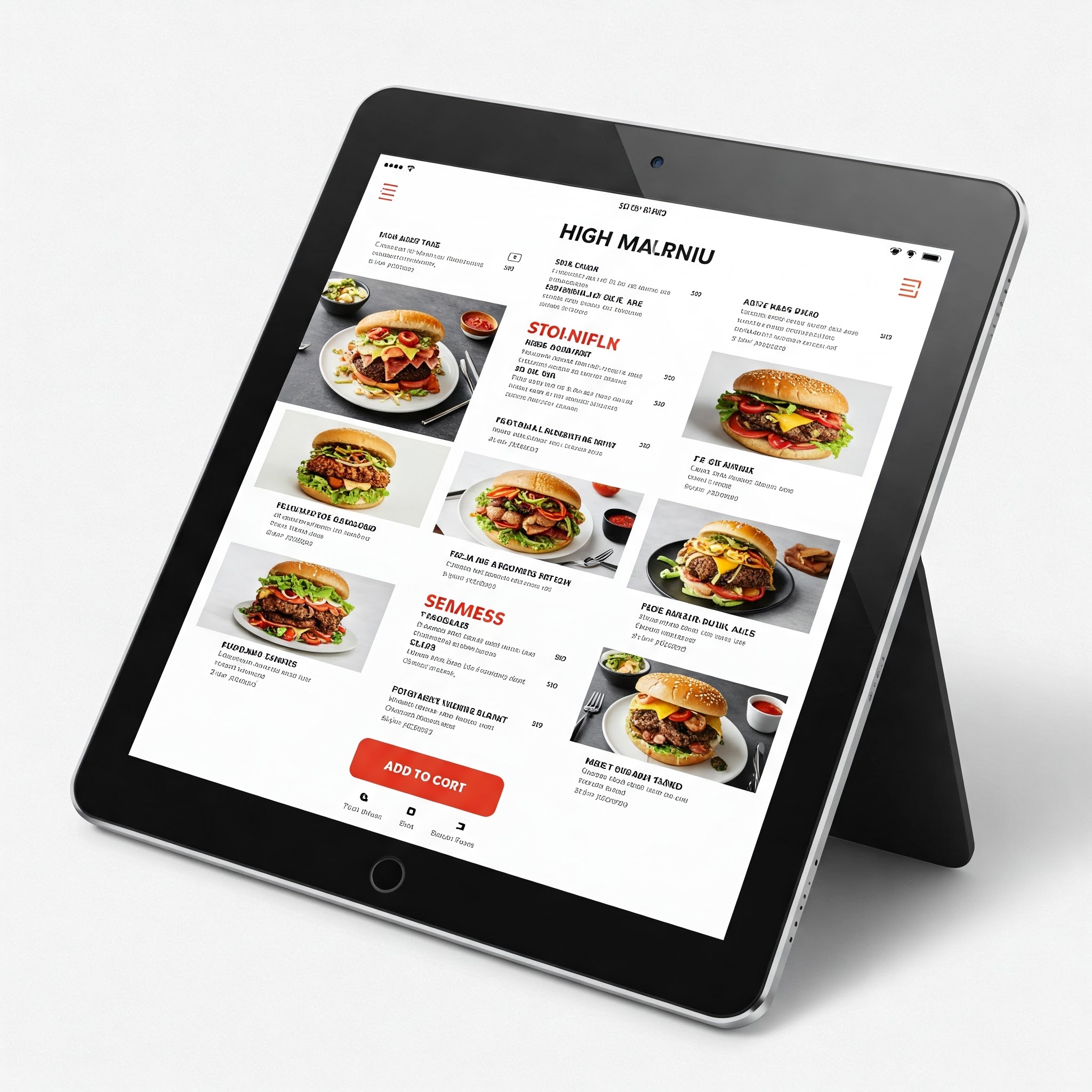
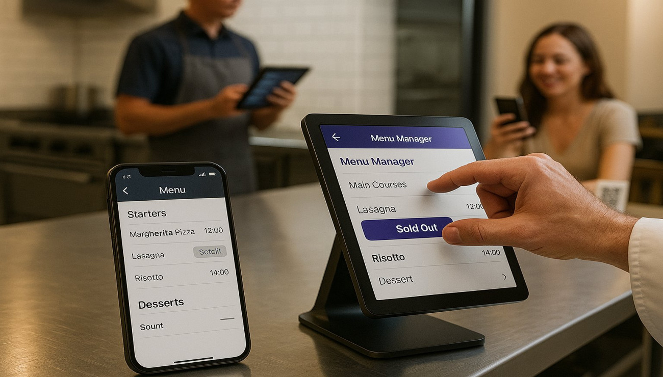
2. QR Code Menu Optimization
Your QR code food menu should be designed specifically for mobile viewing.
- Vertical Layout: Design for how people naturally hold their phones.
- Fast Loading: Ensure menu loads instantly even on slower connections.
- Image Optimization: Use lightweight images that load quickly without draining data.
- Offline Access: Implement caching so the menu remains accessible without connection.
3. Mobile Ordering and Reservation Systems
The ordering and reservation process must be streamlined for mobile users.
- Guest Checkout Option: Allow ordering without account creation.
- Autofill Integration: Enable browser autofill for address and payment information.
- Progress Indicators: Show users where they are in multi-step processes.
- Mobile Payment Options: Integrate popular mobile payment systems like UPI, digital wallets, and Apple Pay/Google Pay.
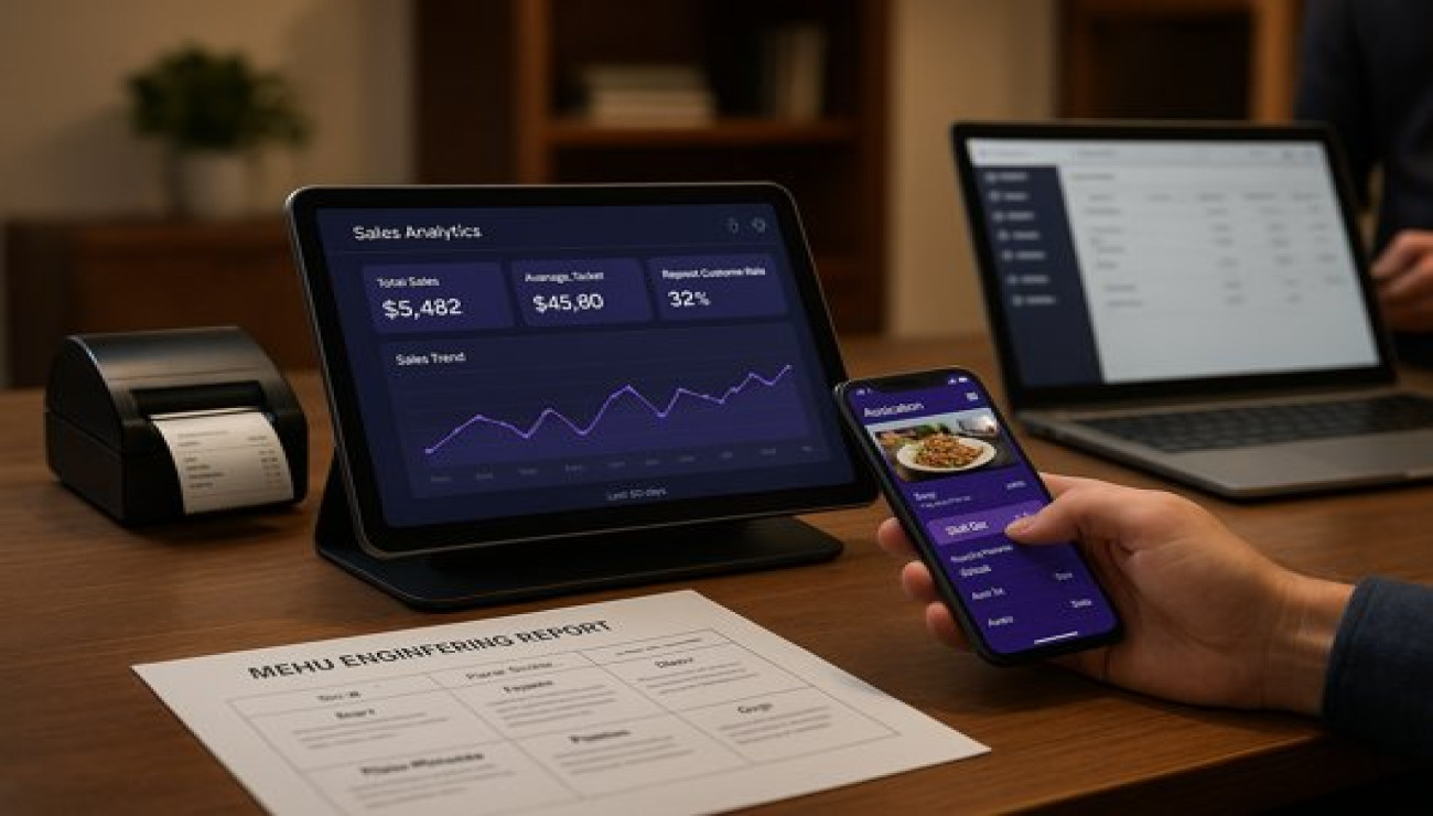
A Case Study: Mobile Transformation Drives Conversions
A popular cafe redesigned their website with a mobile-first approach after analytics showed 68% of their traffic came from mobile devices, but their conversion rate was significantly lower than desktop visitors. They implemented a thumb-friendly navigation system, compressed images to improve loading times, added prominent click-to-call and direction buttons, and simplified their online ordering process to require fewer taps.
Results after implementation:
- Mobile conversion rate increased from 1.2% to 3.8%
- Average mobile page load time decreased from 5.2 seconds to 1.8 seconds
- Mobile bounce rate reduced by 42%
- B2% increase in mobile orders despite overall traffic remaining consistent
- Improved Google search rankings for local terms due to better Core Web Vitals scores
Mobile-First Implementation Checklist
- Audit Current Mobile Experience: Use Google's Mobile-Friendly Test and PageSpeed Insights.
- Analyze User Behavior: Review analytics to understand how mobile users interact with your site.
- Prioritize Speed Optimization: Compress images, minimize code, and implement caching.
- Simplify Navigation: Create thumb-friendly menus and clear information hierarchy.
- Optimize CTAs: Ensure key actions are prominent and easy to tap.
- Streamline Forms: Reduce form fields and enable autofill for mobile users.
- Test Across Devices: Test your site on various devices and connection speeds.
- Monitor Performance: Continuously track mobile conversion rates and loading times.
Conclusion: Mobile as Your Primary Digital Dining Room
For modern restaurants, mobile isn't just another channel—it's often the first and most important touchpoint with potential customers. A mobile-first approach ensures that whether customers are looking for a quick lunch option, planning a special dinner, or searching for delivery, your restaurant provides an experience that meets their needs and expectations. By prioritizing mobile design, you're not just adapting to technological trends; you're embracing how people actually discover and interact with restaurants in the digital age.
Design for the device in your customer's hand, and watch your digital performance transform.


Comments (0)